Helping Raise Visibility, Especially When It’s Your Hometown
By Colin Secore
Featuring dialogue from Jonathon Pfeiffer

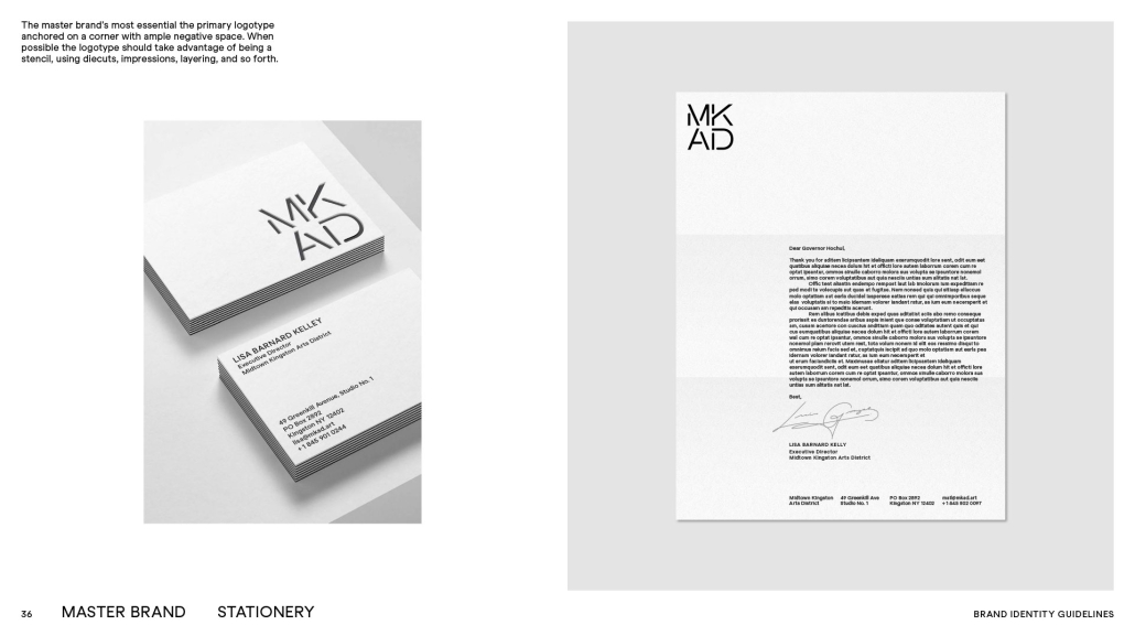
page from MKAD Brand Identity Guidelines
I recently had the pleasure of being able to speak with Jonathon Pfeiffer, a creative director and graphic designer who is responsible for MKAD’s (Midtown Kingston Arts District) new logo as part of their rebrand. I got to learn about his work, his process, and his relationship to Kingston. I was curious about MKAD’s logo and I learned just about everything I could want to know thanks to Pfeiffer. One large aspect that truly fascinated me was just how closely MKAD’s new logo was related to Kingston and its iconography, and I’m excited to talk about it. But first, let me tell you more about Jonathon Pfeiffer.
Jonathon Pfeiffer describes his work as designing “how businesses, non-profits, publishers, and individuals connect to their audiences. This takes many forms: brand strategy, logos and identity systems, books, magazines, packaging, websites, exhibitions, signage, film… the occasional advertising campaign — often, all together.” He was born in Kingston, graduated from Kingston High School, and still has family in Kingston. He has a very close relationship to this city and its art scene, which gave him a special connection when designing a logo for MKAD. “My family still lives here, and I spend most weekends in Kingston,” Pfeiffer explained, “This great place sits at the intersection of nature and art, the gateway to the Catskills. I’m fortunate to have participated in the D.R.A.W. in its earliest days. Growing up with Dia Beacon and Woodstock allowed me to gravitate to art, design, and culture — now Kingston is the Mid-Hudson Valley’s arts center, and the Midtown Kingston Arts District is a huge part of that story.”
I asked Pfeiffer about his process, having always heard about the branching creative efforts of graphic designers but never knowing the details of how it really goes down. I’ve gained an understanding of how much graphic designers have their own varying styles and artistic ideals just like any other artist, and Pfeiffer has a high appreciation for the dialogue between him and his clients. He described design as a journey: “It’s a trip you take on with your collaborators. I try to involve my clients as much as possible, I refer to them as collaborators, they’re the most important part of the process really. Throughout the process, I listen, research to familiarize myself with the subject, and seek out hidden challenges. Ultimately, I transform what I learn into opportunities, creating expressive forms such as stories, symbolism, or really any tool that adds value and communicates.”
What makes this collaboration between MKAD and Pfeiffer especially harmonic is Pfeiffer’s personal relationship to Kingston and growing up to see the importance of community arts. “I’ve been fortunate to collaborate with great clients, but working with people who contribute so much positive change is extraordinary,” Pfeiffer said, “Sometimes it’s not always obvious there are organizations doing work like this, so if you come across a group like MKAD or they reach out to you — jump at the chance to get involved, help raise their visibility, especially when it’s your hometown.”
Having seen the new MKAD logo before knowing what inspired it, learning of Pfeiffer’s inspirations and thought process made everything click. The logo is a crossroads, multiple avenues converging through MKAD and then leading back out into the world. Each letter is almost like a building, represented by the stenciling that’s been used on several of Kingston’s brick buildings throughout time. Pfeiffer described MKAD as having “a beautiful industrial quality that links Uptown’s Stockade District, known for its stone houses, to the diverse styles of Downtown Roundout.” He then went on to say, “With a new name and acronym, the stenciled letters come together at an intersection, symbolizing a hub that connects the community. In Kingston, stencils are stamped on tools used by historic businesses, shipping crates used by artists, and signs in grassroots movements — the junction of everything the organization places itself.”
I decided to ask Pfeiffer about what he personally wished for people to take away from the MKAD logo, or if there was anything that he wanted people to know. I appreciate getting the opportunity to learn a professional’s own thoughts about a commission, since I usually only get to interpret it myself as an outsider. Pfeiffer answered my question with: “Okay, to get a little nerdy… part of MKAD’s brand positioning — at the heart of what it does is ‘advocate, educate, nd celebrate.’ So, in addition to the logo, we have an expressive confetti pattern made up of all the parts of the logo’s stencil parts — it’s used for special occasions like the soirée and other events. There might be other surprising elements we haven’t seen yet — all good fun.” I then decided to ask him about what he might like people to know about him or his work. He laughed and replied, “The amount of time and work I put into it. I’m kidding, that’s actually something I avoid telling clients. But mostly, they should know I enjoy what I do — especially the problem-solving aspect.”
Working with MKAD, and then getting to interview Jonathan Pfeiffer, felt like the efforts of the place I work for coming full circle. Pfeiffer himself got to grow up and experience the arts scene here and would come to be able to channel that experience to represent the Midtown Kingston Arts District. It’s indisputable evidence of the kind of impact MKAD has on this city.


